Case Study: Why an Infographic agency is your report’s best friend
Reports are notoriously dull – just pages and pages of text and a few dry statistics. It makes watching paint dry look like an exciting pastime. Don’t panic here is where a creative agency can turn things around.
Humans are visual learners, which is why infographics work so well. Visualising statistics helps us understand what they mean far better than seeing them on an excel spreadsheet.
The visual-ness (shh, it’s a word) of infographics make them perfect for company reports too, because they naturally engage the reader and encourage people to remember the information being presented.
And because infographics each tell a story, they can be shared both as part of a report or on their own – allowing you to make the most of all the hard work that goes into a well-designed report.
Here are some examples of just how infographics agencies in the UAE can change your report and how to make them really stand out:
Think visually
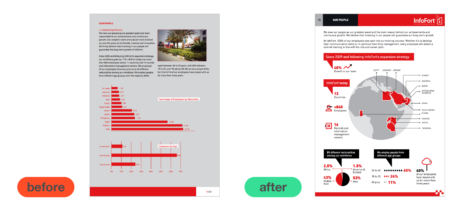
 This is a great example how visualising data differently can make it more impactful and easier to understand. Our client has employees across the globe, and they wanted to visualise their employee network in their annual report. Before the report showed where the employees came from on a standard bar graph, but this wasn’t the best way of representing the global nature of the business. We put the information on a map, and now you can really see where staff are and how they are connected!
Use iconography
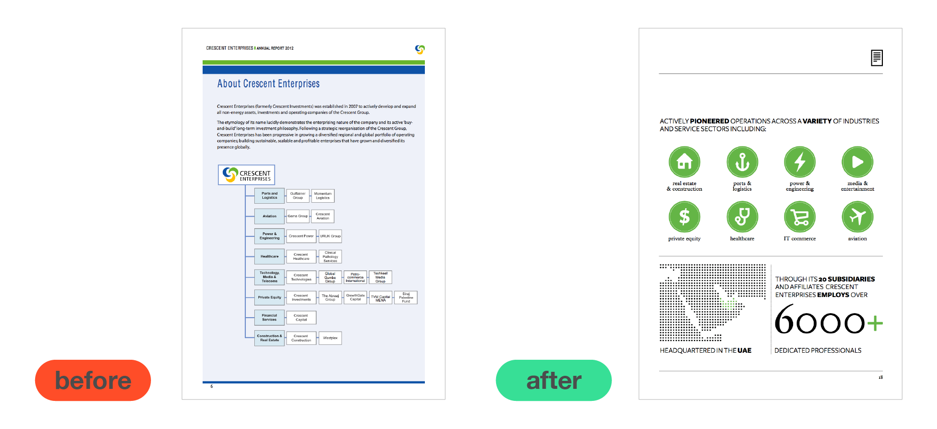
 I love using iconography, because they often mean you don’t have to explain something with words. Take this ‘before’ example – even though the information is in a chart, there is lots of text and it takes a long time to read and understand. Once we added iconography, it became much clearer because of the simple icons and reduced explanatory text.
The use of blank space also breaks up the page and makes it really pleasing to look at. Which brings us onto my next tip…
Use blank space
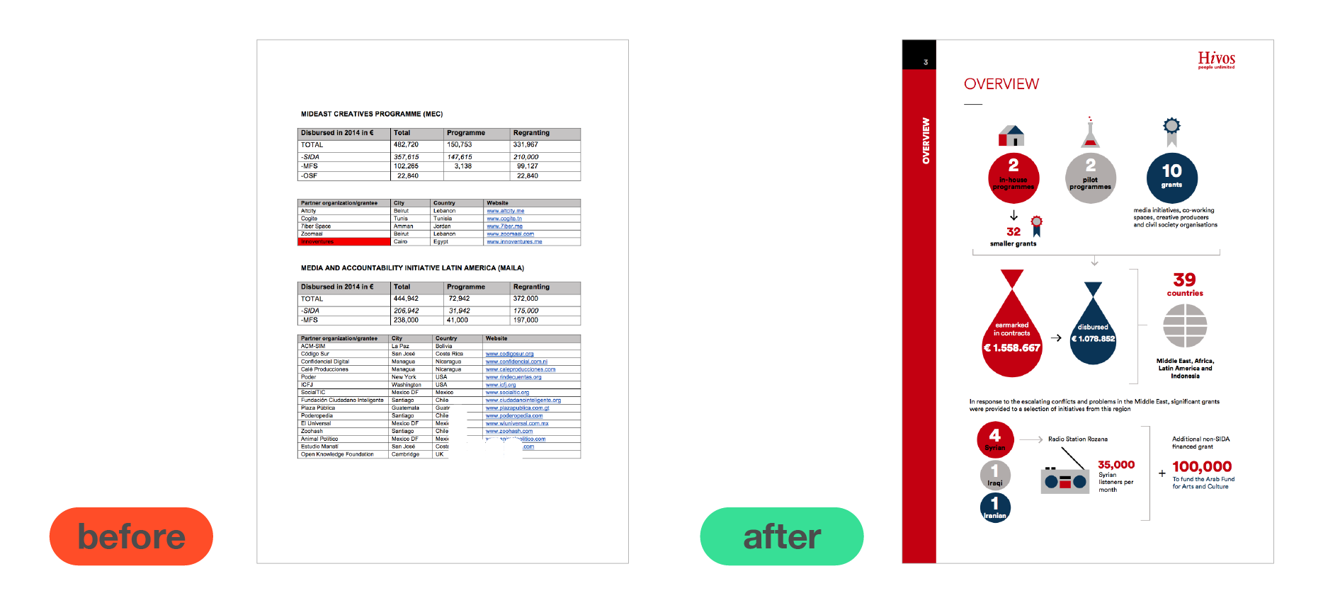
 This particular client just gave us a draft version of their report, and it’s not uncommon to see reports full of tables that look like they’ve been made in Excel. We took all that information and added icons, used colour effectively and, most importantly, allowed room for the information to breathe. I think you’ll agree that the end result looks much more digestible!
Good design is all about simplicity and that means not cramming loads of information onto one page. Simplicity is key and simplicity means leaving negative space.
Be selective
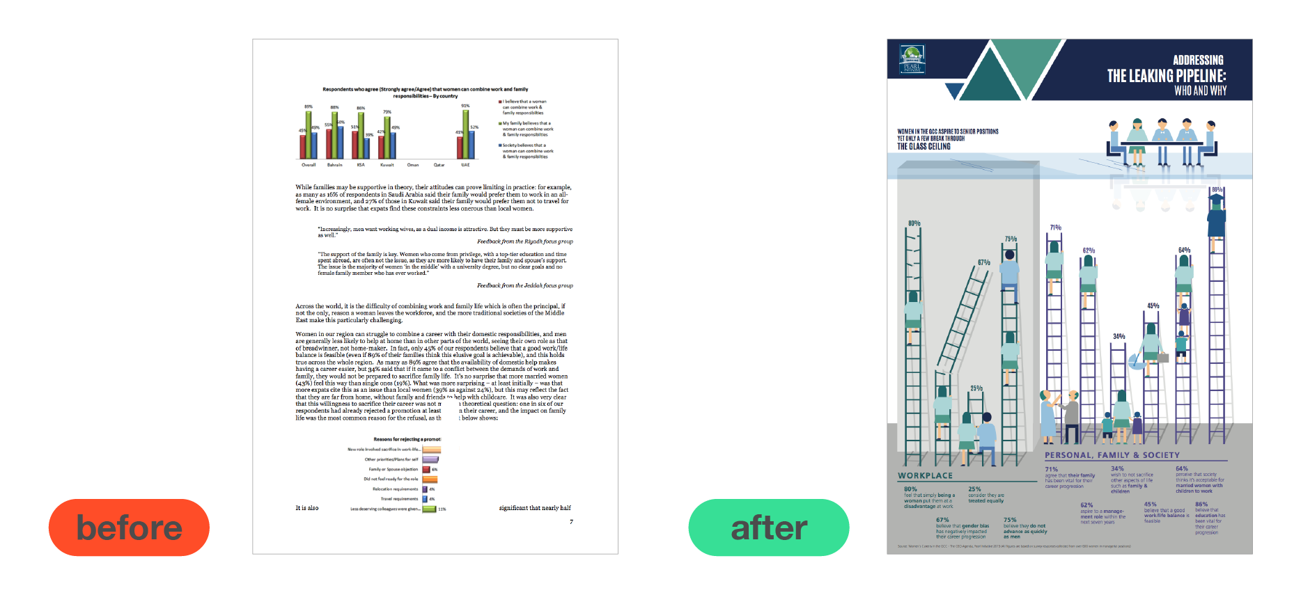
 This is a great example of just how much an infographic can transform your report. It sums up what visualising data is about – creating a stunning visual that’s also informative.
Before, important and interesting stats were put in long bits of text and badly-made charts. We picked out the most important, interesting and relevant ones and transformed them into an infographic that tells a story that people want to read!
If you need help putting together a report or infographic, contact us to see how we can work together.
