When To Use Visual Communication Design For Your Business
Infographics are impressive. Or so you’ve heard. Sure, visual communication design is useful in business, but that doesn’t mean that using an infographic is always the right choice.
So if you want to use them in your marketing but not sure if you should, relax – we’ve got you. Here’s all you need to know about when to use an infographic to visualize data.
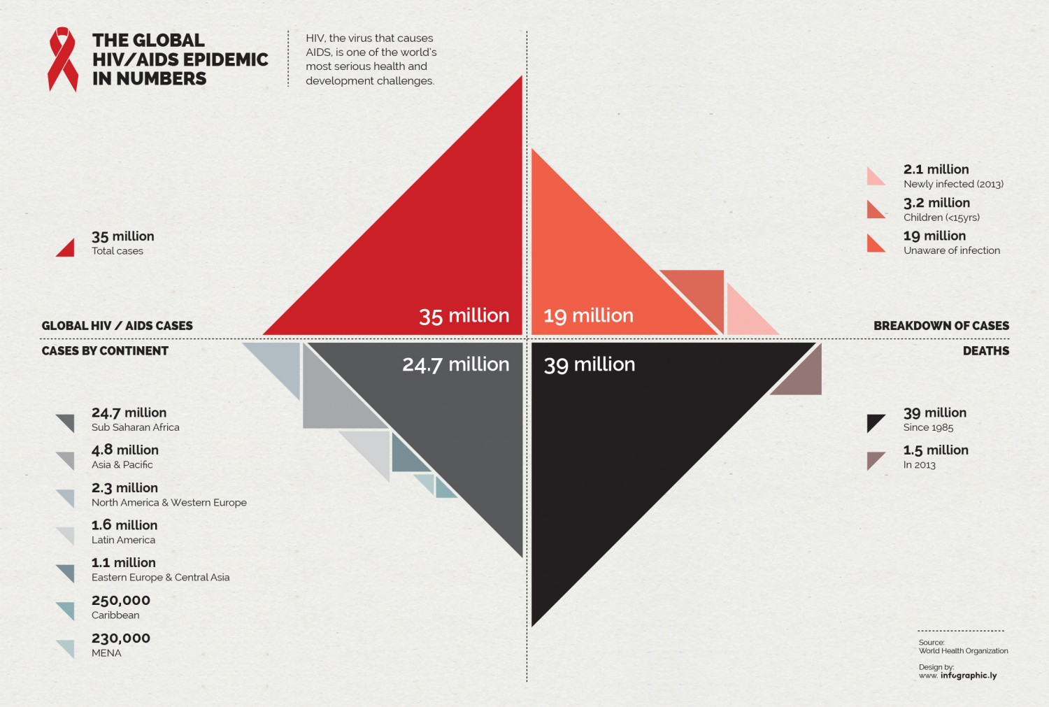
When you have LOADS of data
If you have a big lump of statistics you’re not sure what to do with, an infographic could be the way forward. For example, when you have data for comparison it’s much easier to understand it when it’s visualized to scale.
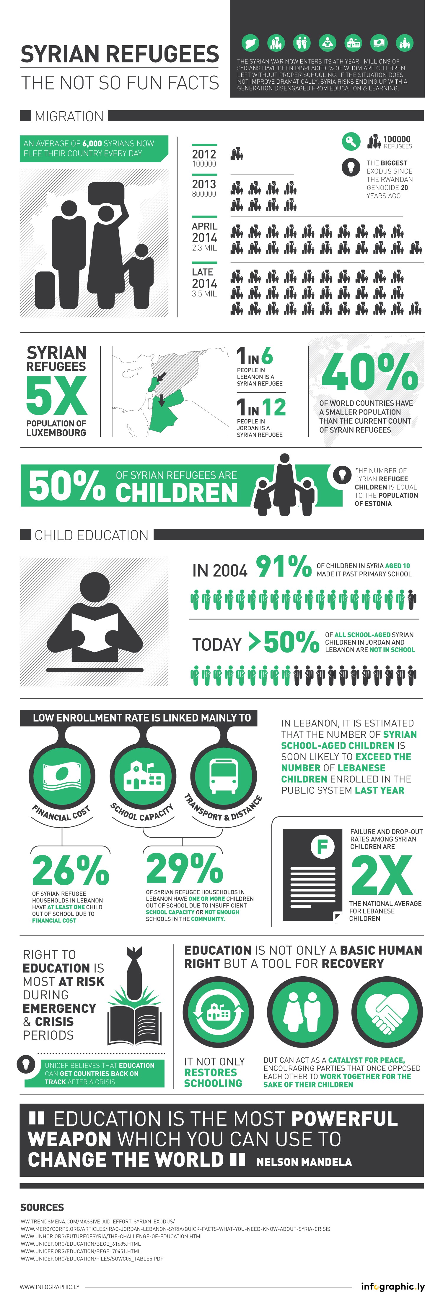
 When you want to raise awareness
Infographics are all about helping your data make impact, so they really come into their own when trying to raise awareness for specific issues, such as the plight of Syrian refugees.
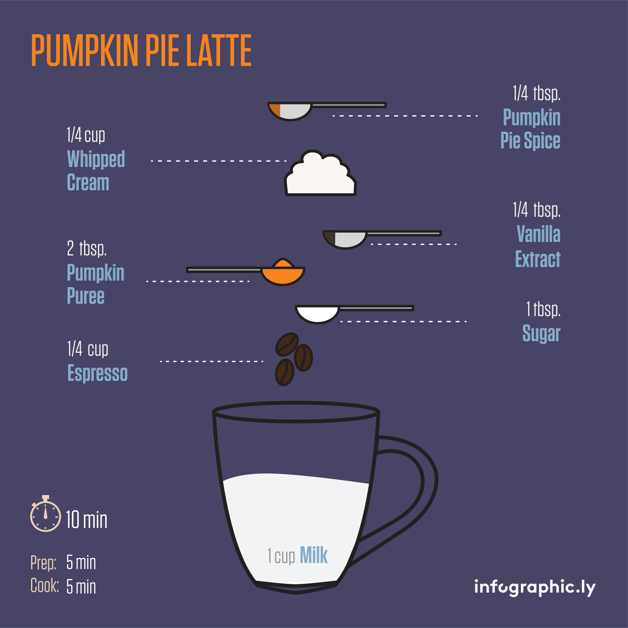
When you want to be clearInfographics are also great for explaining processes. Take IKEA manuals. They come with zero words – just step by step images. Below we demonstrate how to make pumpkin pie latte in an infographic… easy right?
 Still not sure if an infographic would work for you? Let’s break it down even more:
Is the data difficult to understand in written form?
If yes, then you might just need an infographic. There’s nothing worse than being bombarded with facts and figures and then being asked to make sense of them yourself. Humans are visually wired, so breaking complex data down visually helps us understand it.
Do your users like infographics?
Infographics are built to be shared on social media. Generally people respond very well to infographics (is the visually wired thing), and research has shown that 45% of web users will click on a link if it features an infographic. But some audiences may not, so keep an eye on whether yours is responding to your content. If not, you may want to rethink.
Have you overused them?
As much as most people love data visualization, if you’re constantly pumping out the same type of content users can get bored, and your hard work won’t have the same impact. Less is more in this instance. While infographics can work with many different kind of things, save the infographics for the really important, complex stuff.
Need more advice? Think we’ve missed something? Tweet us @infographicly_