The Dos and Don’ts of Design
Designing is hard. Super hard. Mainly because it’s so easy to get spectacularly wrong, especially when you were supposed to deliver that report or presentation yesterday. But when design works, it really works.
Luckily there are a few basic design rules that everyone can follow to create something that’s not only simple, but powerful.
I’m planning to go into more detail in a later post, but for now, here’s a handy guide on what to do and what not to do in design.
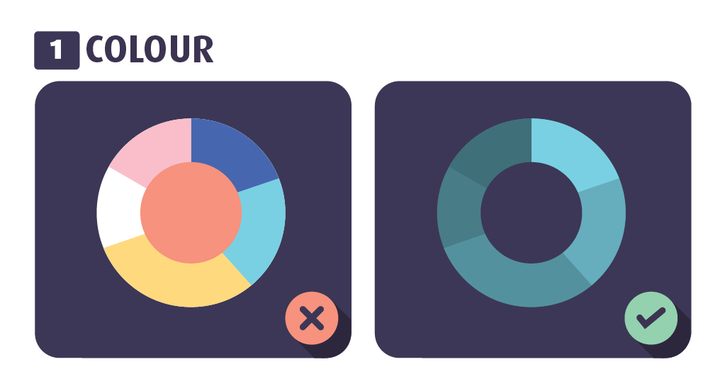
Colour
Colour in design can be tricky to get right. Using the right colours as well as the right number of colours is key. Whilst using all the colours of the rainbow is great for drawing, well, a rainbow, it’s not the best of ideas for creating sophisticated design.
Do: Use colour sparingly to highlight important information.
Don’t: Use more than five colours in a layout.
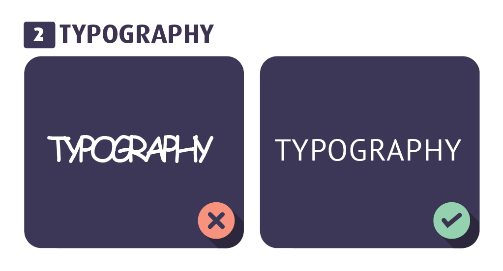
Typography
Typeface, typography, font, whatever you want to call it, is super important for the feel of a design. There are a few simple rules: don’t mix too many typefaces, make sure it’s readable and sort out spacing. This all sounds a lot easier than it actually is, but as long as you stick to the basics, it’ll look lovely.
Do: Make fonts legible and fitting for the design.
Don’t: USE COMIC SANS(!)
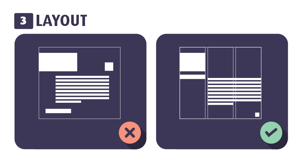
Layout
There’s a reason books are laid out the way they are, they’re easy to read. Putting things in a logical order is the key to a good layout. Good layout = intuitive design. Simple.
Do: Guide readers in a logical order.
Don’t: Forget about alignment, it helps create consistency.
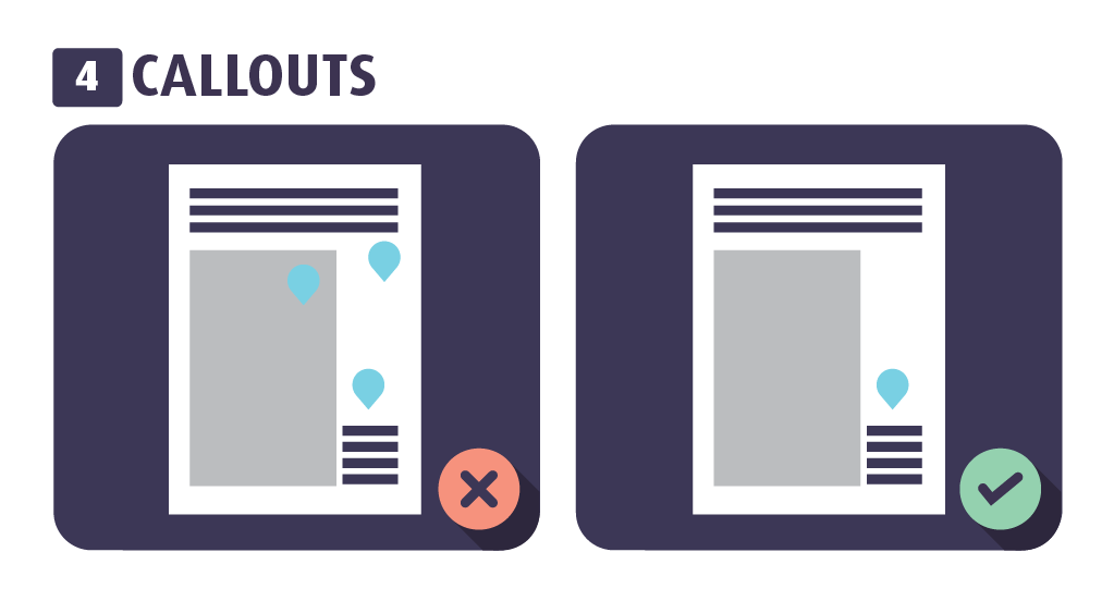
Callouts
Callouts (AKA speech bubbles or quotes) are prone to being overused. Too many callouts dilute the purpose of what you’re trying to say. Use them sparingly.
Do: Focus on one key point in each callout.
Don’t: Litter the design with them.
Space
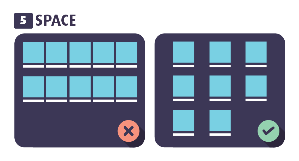
The backbone of good design is to present something both visually and effectively. This can be disrupted by overloading something with too much information. The ‘empty’ parts of a design can be just as important as the parts you fill.
Do: Leave plenty of negative (blank) space.
Don’t: Cram loads of information into a tiny space.
Visuals
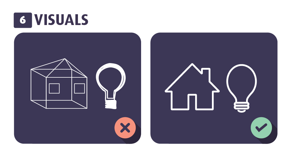
Illustration, photography and iconography can be hard to get right in design. The main thing to remember is to only use visuals if they enhance the context. If they don’t, then it’s time to get rid of them.
Do: Choose visuals that are in the same spirit. It all needs to match.
Don’t: Use complex designs that distract the eye.
Simplicity
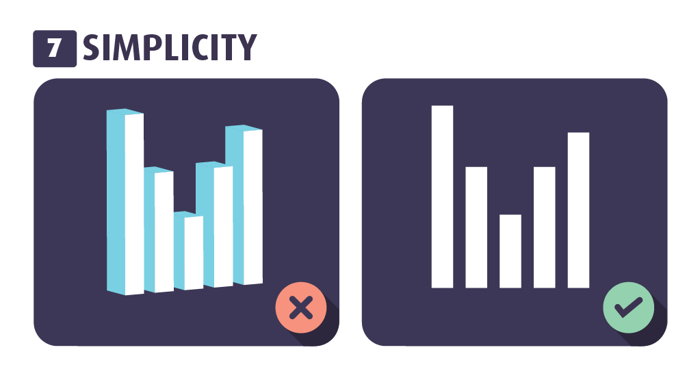
The best designs are always the simplest. Keep things clean, straightforward and effective. When it comes to design, less is always more.
Do: Always aim for quality over quantity.
Don’t: Use gimmicky elements, like 3D charts and shadow effects.
For examples of great visual communication design, check out our work on our website.
