9 Moments in Data Visualization That Changed Everything
Data visualization has come a long way from line graphs and pie charts to the beautiful infographics we all have come to know and love.
We’ve delved deep into the history of the infographic and charted (or more correctly, blogged) its evolution. So sit back, relax and enjoy our rundown of game-changing data visualizations.
1644: All Roads Lead to Rome

Infographics, charts and graphs all started from a humble 1D line graph, and this one from 1644 by Michael Florent van Langren is believed to be the first ever visual representation of data.
The simple, line diagram shows twelve different estimates of the difference in longitude between Toledo and Rome, alongside the name of the astronomer who made the observation. Yawn, we know, but this was revolutionary at the time.
Let’s hope no time travellers go back and tell him any ten year-old could draw something similar in minutes.
1801: Turkish Delights
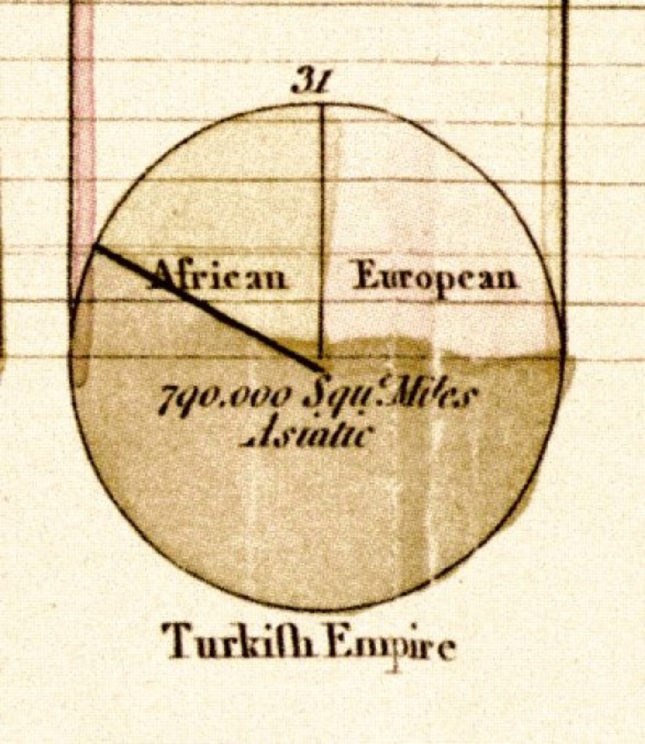 Imagine not having line graphs, bar charts and pie charts in the world. Data would be chaos and the world would come crumbling down. OK, maybe not crumbling down, but it would be very inconvenient.
We have William Playfair to thank for the invention of all of these. This is the image of the first ever pie chart, made in 1801. Yum.
1815: Rock Nation
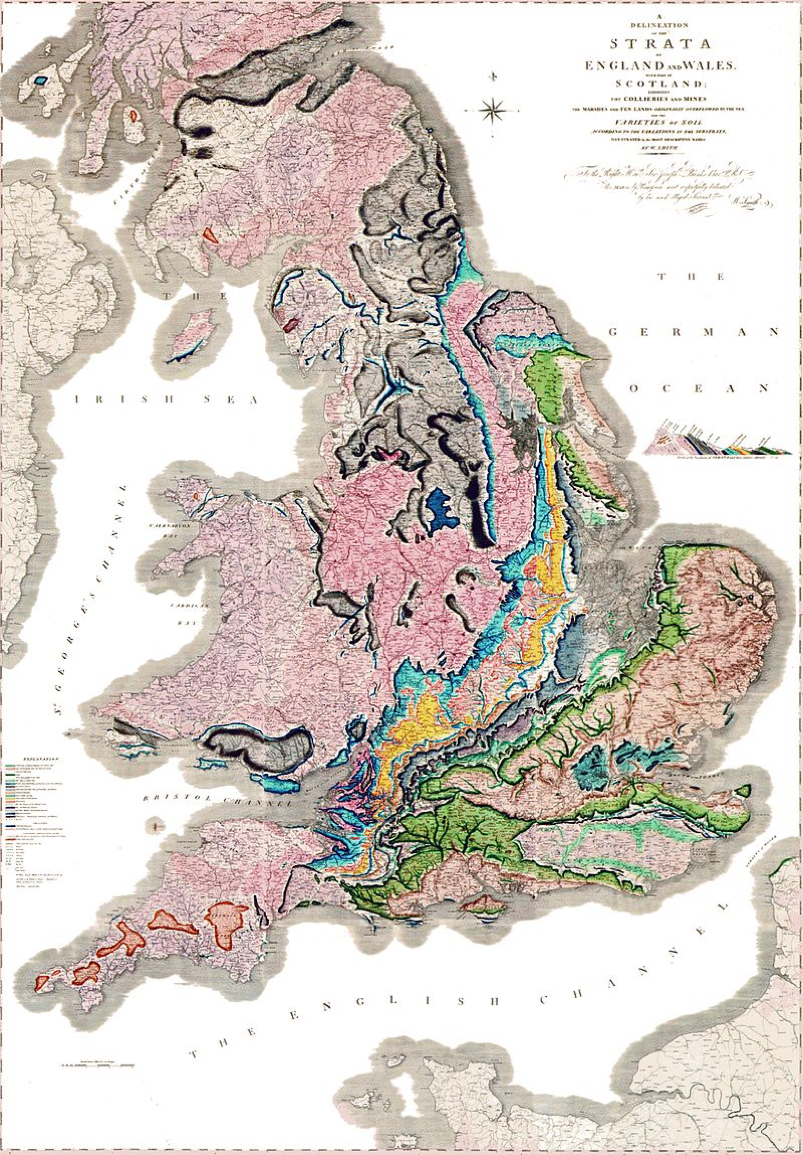 Mapping the whole of Great Britain is no mean feat. But being the first person to map the geology of it – now that’s pretty impressive. William Smith created this map of the UK showing the different types of rock formations found UK in 1815. You could say this map rocks.
(Sorry, we hit rock bottom with that one).
1858: Macabre Discoveries
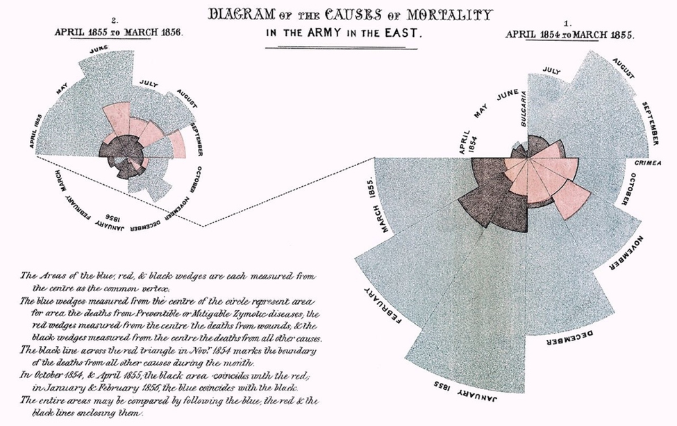 We have Florence Nightingale to thank for not having to worry about leaving hospital worse off than when we walked in. But Flo wasn’t just the founder of modern nursing and an all-round saint. She was also a renowned statistician and the creator of some super-important data visualizations.
Take this 1858 diagram, which shows the causes of mortality of soldiers in the Crimean War and helped convince Parliament that sanitation was crucial to lowering mortality.
1859: The Tree of Life
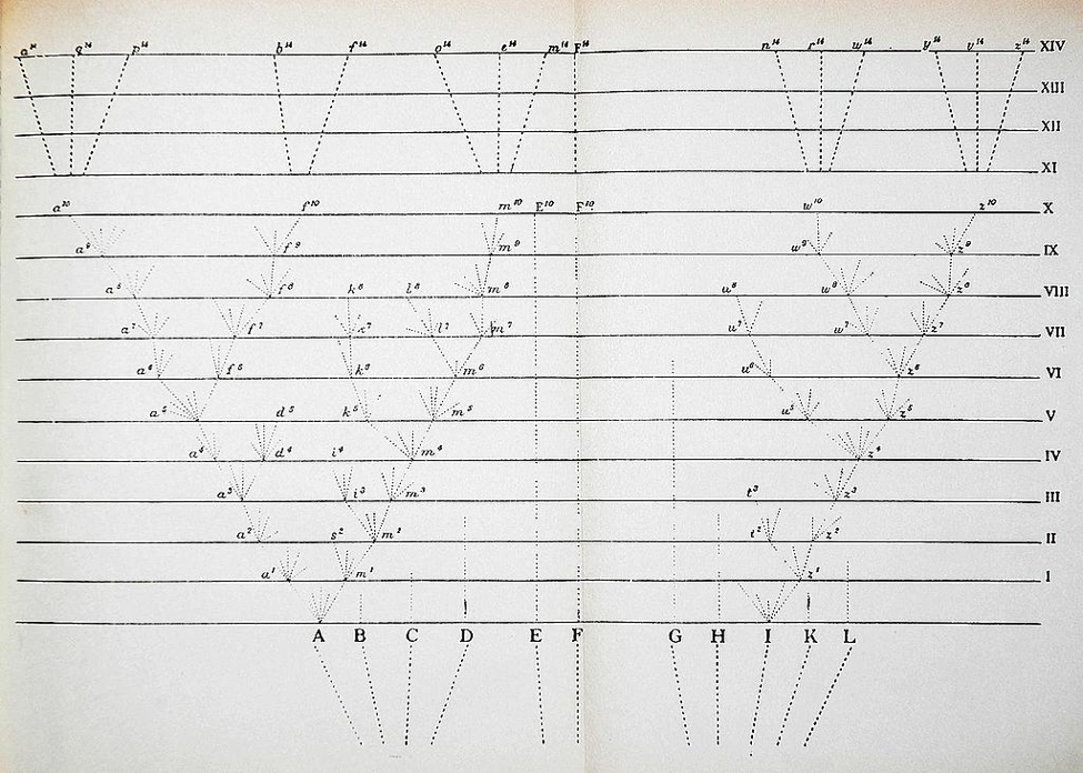 Charles Darwin was a pretty clever guy. He not only came up with the whole theory of evolution, but also one of the greatest diagrams science has even seen: the Tree of Life diagram.
This simple diagram from his 1859 book “On the Origin of Species”, means even the least evolved of human beings can understand his theory. Tree diagrams are now commonly used to depict and calculate mathematical probabilities.
1869: Battling the Elements
 We have a man called Dmitri Mendeleev to thank for forcing kids worldwide to learn a table of seemingly random elements off by heart.
Old Mendeleev developed the first ever table in 1869 and it started off with loads of gaps and uncertainties. This one isn’t as easy on the eyes as the ones we see today, but it was just as important (and as annoying to memorise) and forms the basis of our modern day periodic table.
1934: Getting Social
 Zuckerberg wasn’t the first guy to come up with the an idea to map social networks. Way before Facebook, Twitter or LinkedIn, people were studying how groups of people interacted, and in 1934 Jacob Moreno came up with a way to map these visually.
We bet he never thought his invention would lead to more ways for friends to share pictures of cats.
2003: World of Data
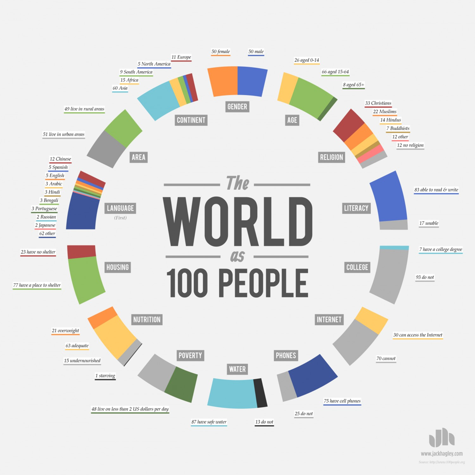 It’s hard to get your head around just how many people there are on our little planet. Data like this is where infographics really shine: seeing the world as 100 people breaks down info into digestible chunks.
First published in circa 2003, this infographic has been updated many times but was originally based on Donella Meadows “State of the Village Report” from 1990.
(Let’s just hope we’re not actually left with 100 people on the planet broken down into digestible chunks.)
2015: Going Viral
 This infographic by Niraj Naik of The Renegade Pharmacist was ALL over social media when it was published in May 2015. Many of us promised never to touch a can of coke again… for about a week.
While the actual sources are a bit dubious it shows the immense power that infographics and social media can have together.
Here at Infographic.ly we’re data-mad and visual-obsessed. Got some data that should go down in history? See how we can transform it over on our examples page.
