How Motion Infographics Are Changing How We See the World
Infographics are a powerful way to present data in a simple, visual format that anyone can understand and is super-shareable. It’s no wonder businesses benefit from the use of infographics in their marketing.
I love infographics not just because they’re just a savvy business tool, but because they can be used as a force for change.
To me, the key to changing the world is education, and infographics are a great way to share knowledge. This is also where social media comes in, as it means ordinary people can spread the word about a cause close to their heart.
Animated, video and interactive infographics can be even more hard-hitting than their static counterparts. Movement adds a whole other dimension to the way you can visualize data, and allows you to dynamically add multiple layers of information in ways that can’t be done in a simple infographic. When you’re dealing with complex social issues that’s exactly what you need.
Here are just a few of my favourite ways motion and interactive infographics are helping us see the world differently.
Reminding us to be eco-friendly
Water is precious, and Every Last Drop have come up with a great way to help people understand just how much water they use every day – and hopefully cut down too.
 Revealing the impact of poverty
The girl effect explores how poverty negatively impacts a girl’s life, and how education has the power to transform their lives in this great video infographic. Their more recent interactive infographic is also impressive and really shows how effective motion infographics can be.

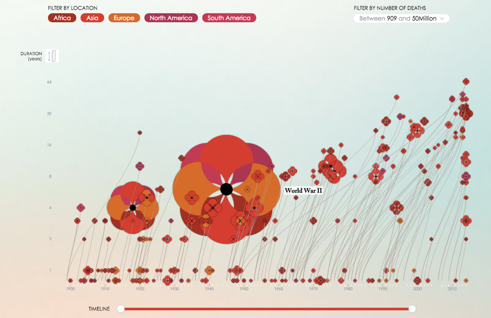
Quantifying the atrocities of war
This is a great infographic marking the centenary of the Great War. Even though the topic is a bit macabre, the way it tells the story of something so horrific in a beautiful and visual way is fascinating to me.
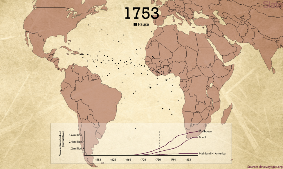
Charting the slave trade
This video infographic maps the journeys of 20,000 slave ship voyages in just two minutes. It’s powerfully haunting and lets us fully grasp the scale of the slave trade, the repercussions of which have had a lasting effect on our world today.
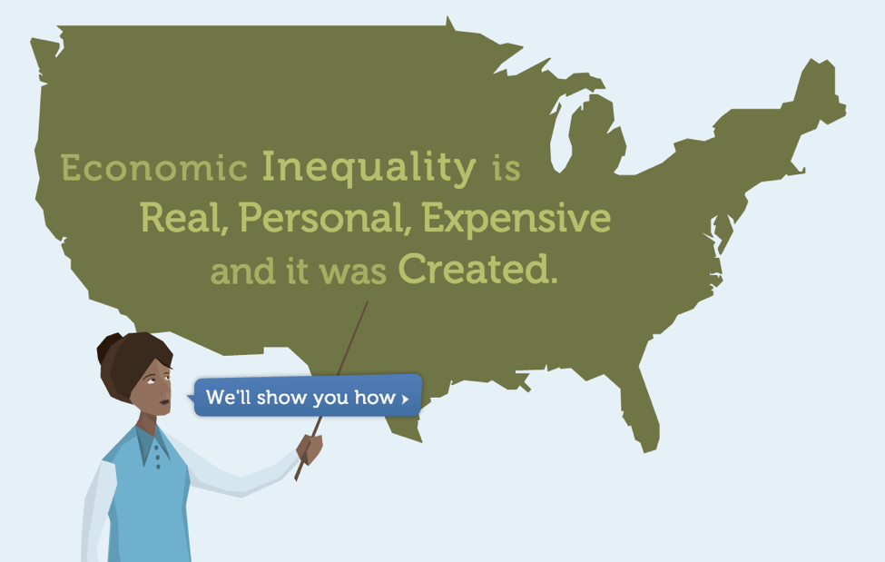
Exposing the realities of economic inequality
Interactive infographics don’t get much more immersive than this. Even though the data is based on US figures, you can get an idea of how economic inequality works in a lot of capitalist countries. Not only does it explain how wealth is distributed, it also shows you where you fit into that picture.
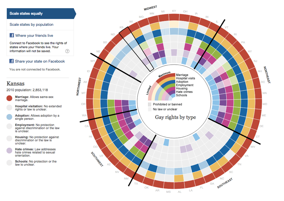
Depicting the variation of LGBTQIA+ rights
Despite the many, many people fighting for equality for LGBTQIA+ people in the US, the laws are still inconsistent from state to state. This interactive infographic allows you to scroll over each state and see how much progress has been made.
Explaining the refugee crisis
The refugee crisis in Europe is a complex issue, and this video infographic debunks the myths and explains the origins of the crisis in a clear, easy to understand way.
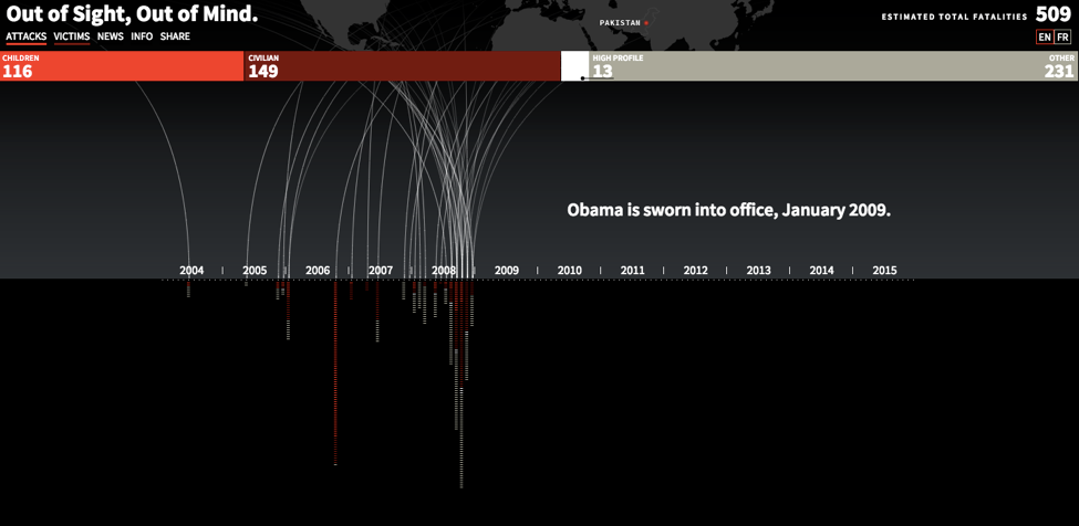
Showing the impact of drone strikes
Telling the real story of what happens during war and conflict is important. This interactive infographic paints a bleak and harrowing picture of attacks on Pakistan by US drones and the number of victims.
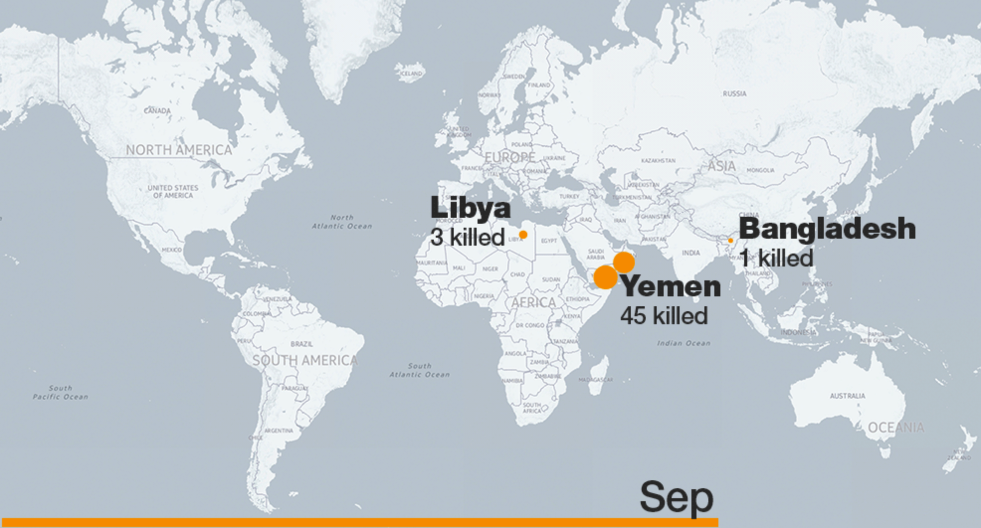
Mapping terrorism
Visually, this is a great way of understanding the impact of terrorism across the world. It’s clear, concise and can help counteract some of the more scaremongering type figures in the press. This one maps out attacks by ISIL in 2015.
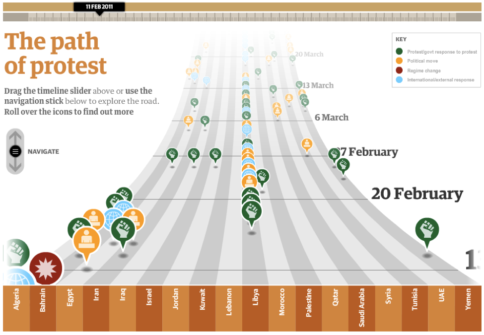
Documenting the history of revolution
This is a great interactive timeline made by the Guardian during the Arab spring. There’s so much information on here it could keep you occupied for hours.
 Have I missed any of your favourite social change infographics? Tweet me @cocolinda78
