Beyond Comic Sans: How to Master Typography
Put your hands up if you’ve ever used Comic Sans. It’s OK, we’ve all been there. We were young and naive, living in a world where clip art plagued our noticeboards and your homework wasn’t complete without a Microsoft Word art heading. The time has come to forgive ourselves.
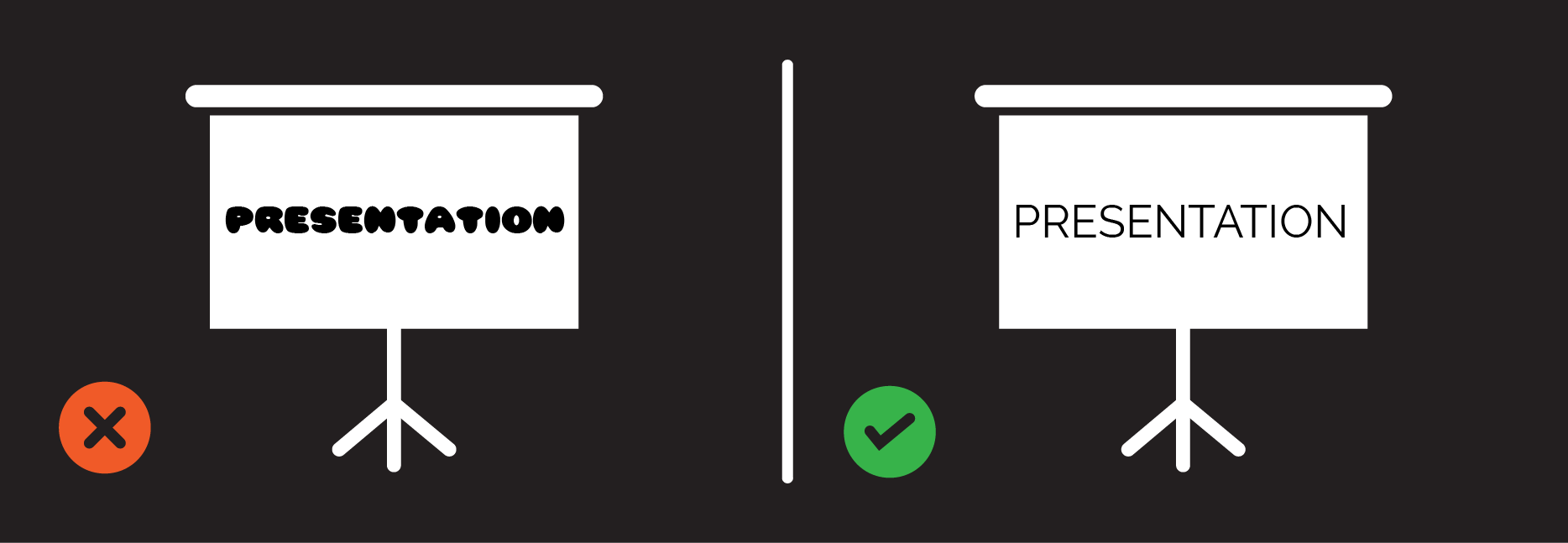
But for those of you who are still using Comic Sans – just stop. Stop now. There is no excuse.
For whatever you’re designing, typography is important. This doesn’t just mean choosing the right font (aka anything but Comic Sans), it means the difference between amateur and professional design.
The basics of typography are simple and I’ve come up with a guide that everyone can use. These guidelines are not just for infographic and visual communication design, they’ll help any presentation, report or letter. Let’s go:
Get the spacing right
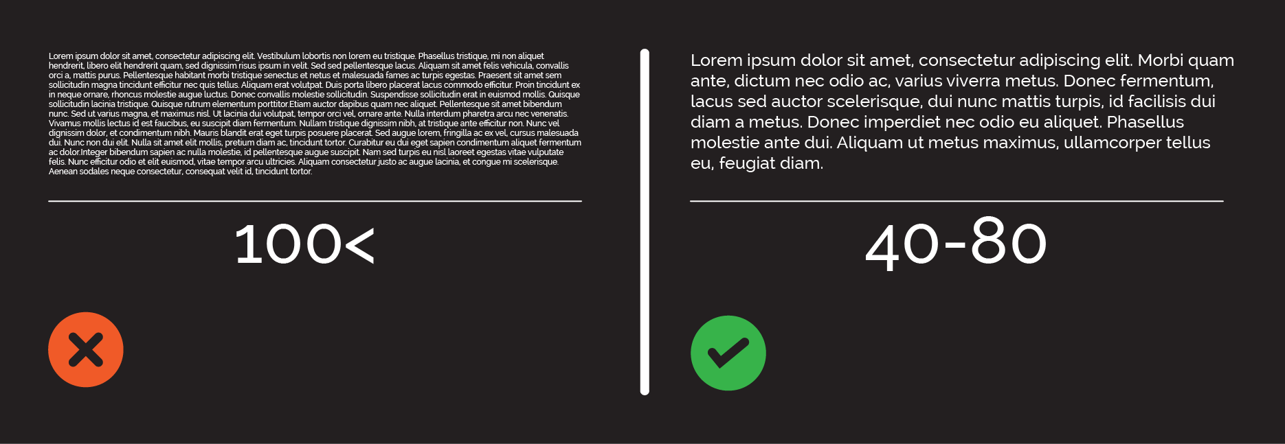
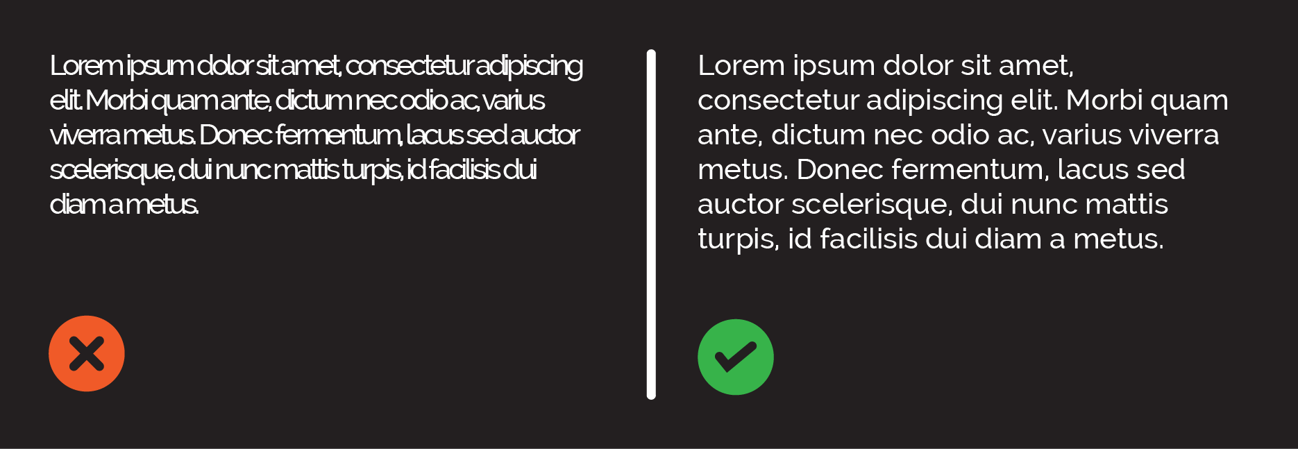
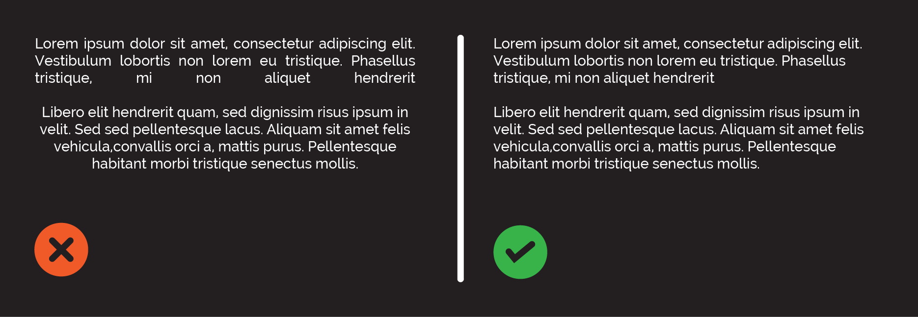
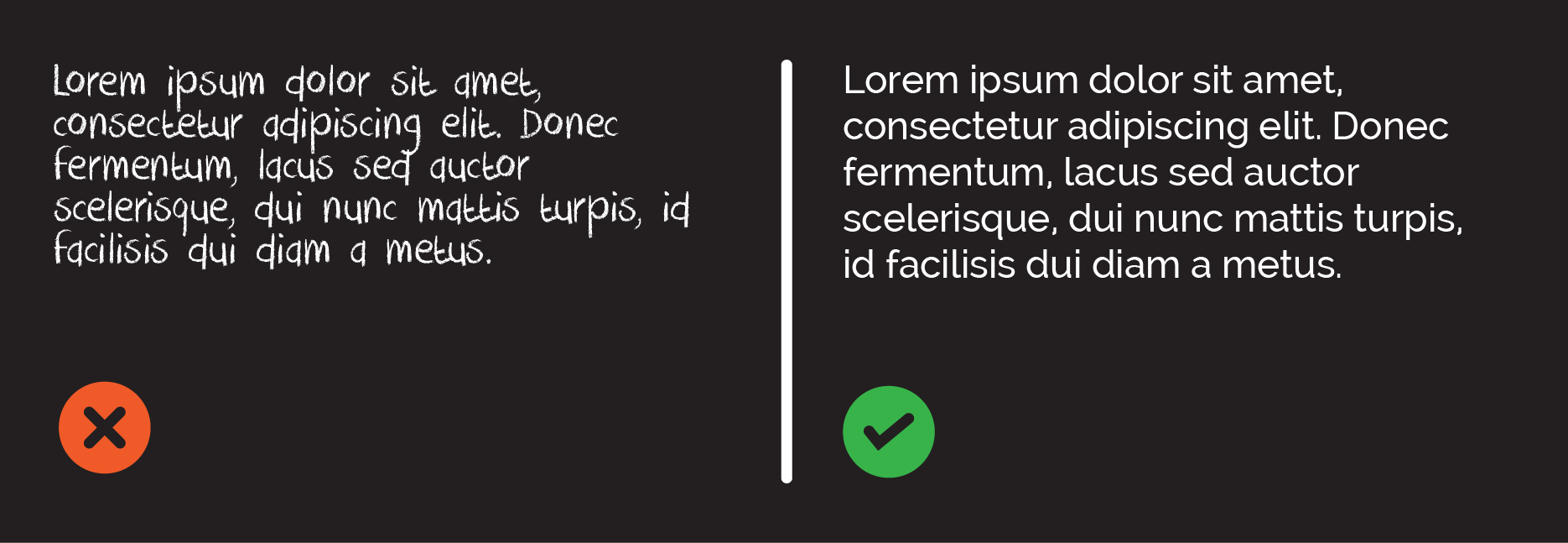
Measure is the length of a line of type. Short measure is easier to read as it takes the eye less time to locate the next line. if there isn’t much type, like for example on an infographic, you can keep it narrow, but otherwise 40-80 characters is best for readability.
Tracking is the space between letters. If you’re short on space don’t reduce this as it can really reduce readability. Cut some type instead.
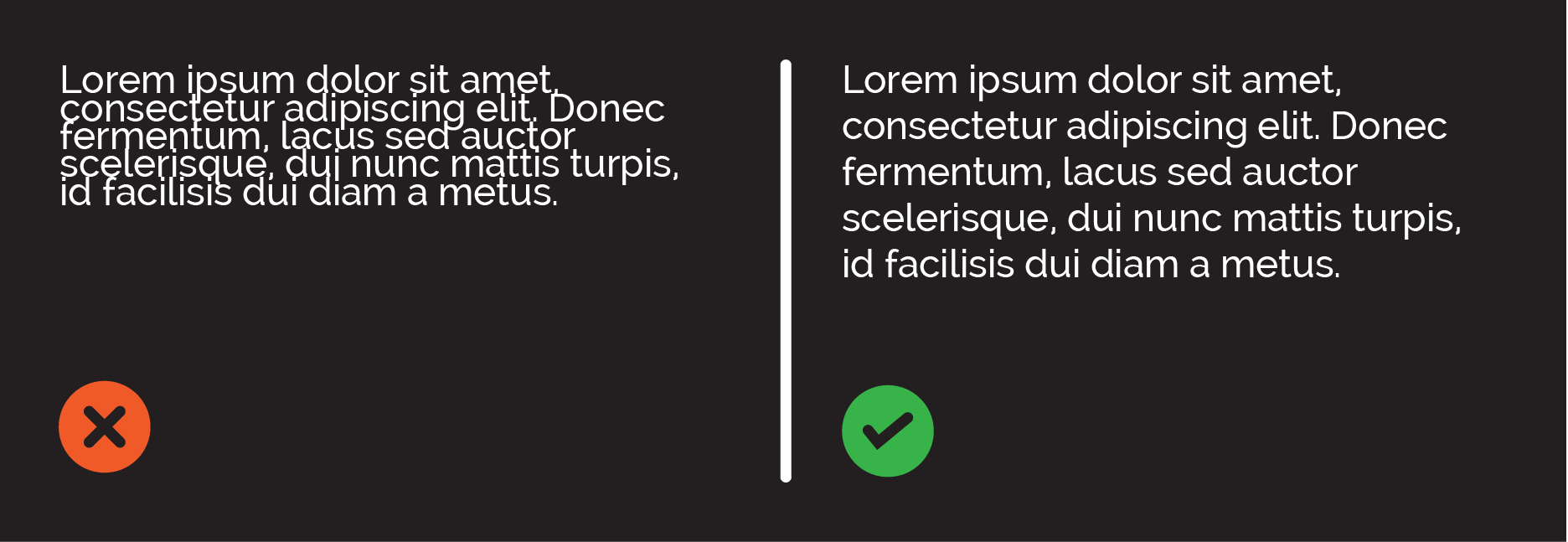
Leading is the space between lines. Again, this shouldn’t be too tight or loose. It’s all about making it readable. Make sure you scale down proportionately. Sometimes people stretch or condense type so it’s distorted when they mean to increase or decrease the font size.
Make it readable
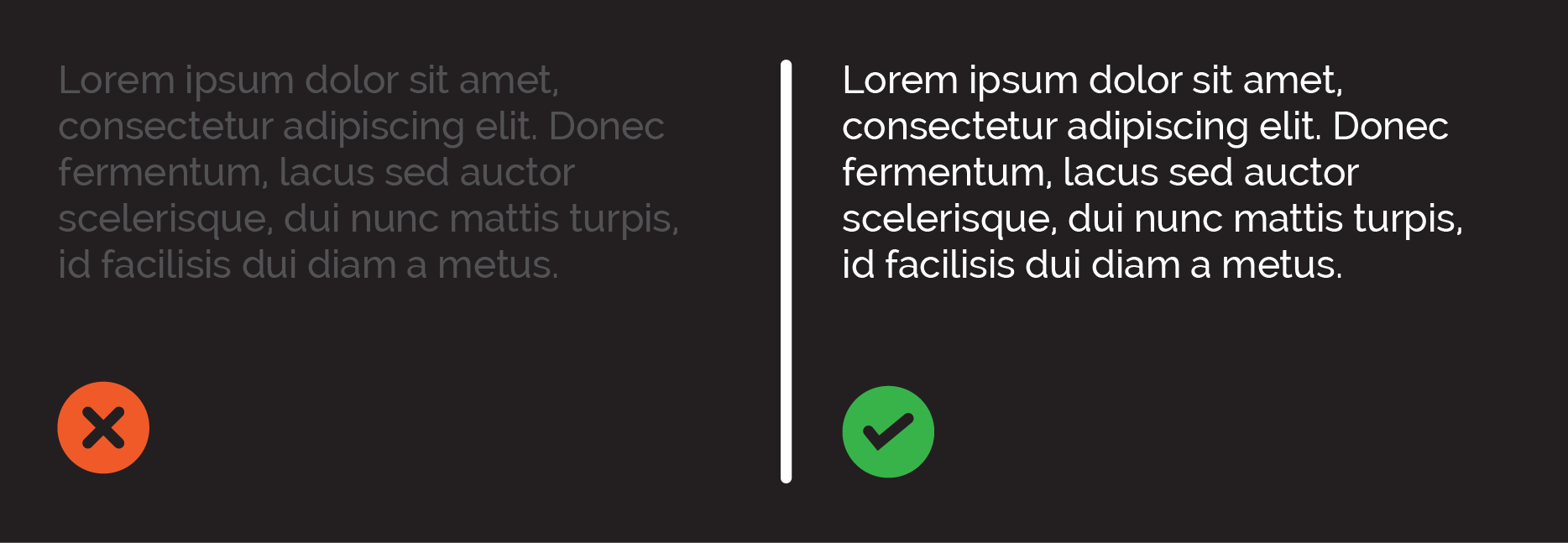
The main purpose of design is communication. There’s no point in creating something beautiful if people can’t read and understand it. It’s important to make sure all type is legible. It seems simple but people do make these mistakes. Fonts can be too small, or background colours clash, making the whole thing impossibly illegible.
It’s helpful to think of all work like a book. A book flows naturally from left to right. Always stick with this format, as people intuitively view work in this way.
Keep alignment consistent
This means keeping everything left aligned, or centre aligned, or right aligned, not swapping between them (avoid justified alignment, it creates annoying white spaces between words). When you do this you’ve also got to be careful to make sure ragged edges are corrected. Ragged edges are bits of white space at the end of lines that just need to be fixed by changing where the lines break, making the edges look more uniform.
Fix orphans and widows
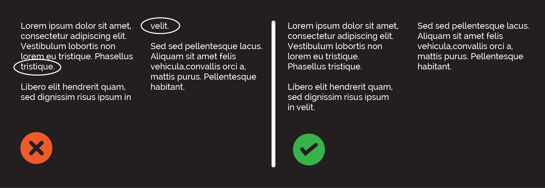
Orphans and widows are ends of paragraphs of text that seem to hang, leaving a lot of white space in body copy. These white spaces interrupt the text and generally look rubbish. They are easy to fix though, just change where the previous line breaks.
Don’t use too many typefaces
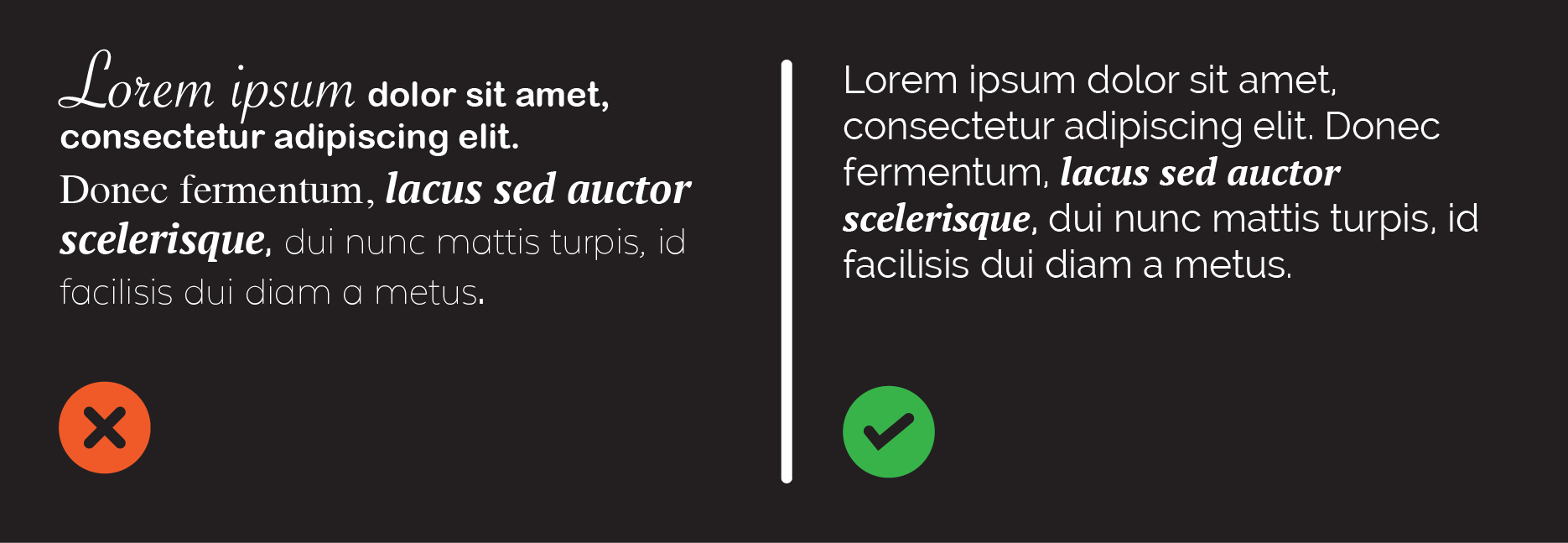
Too many typefaces just look like a mess. Professional design means clean and simple. It’s best to stick with two or three (at the most) different typefaces to avoid the unwanted cluttered look.
Use matching fonts
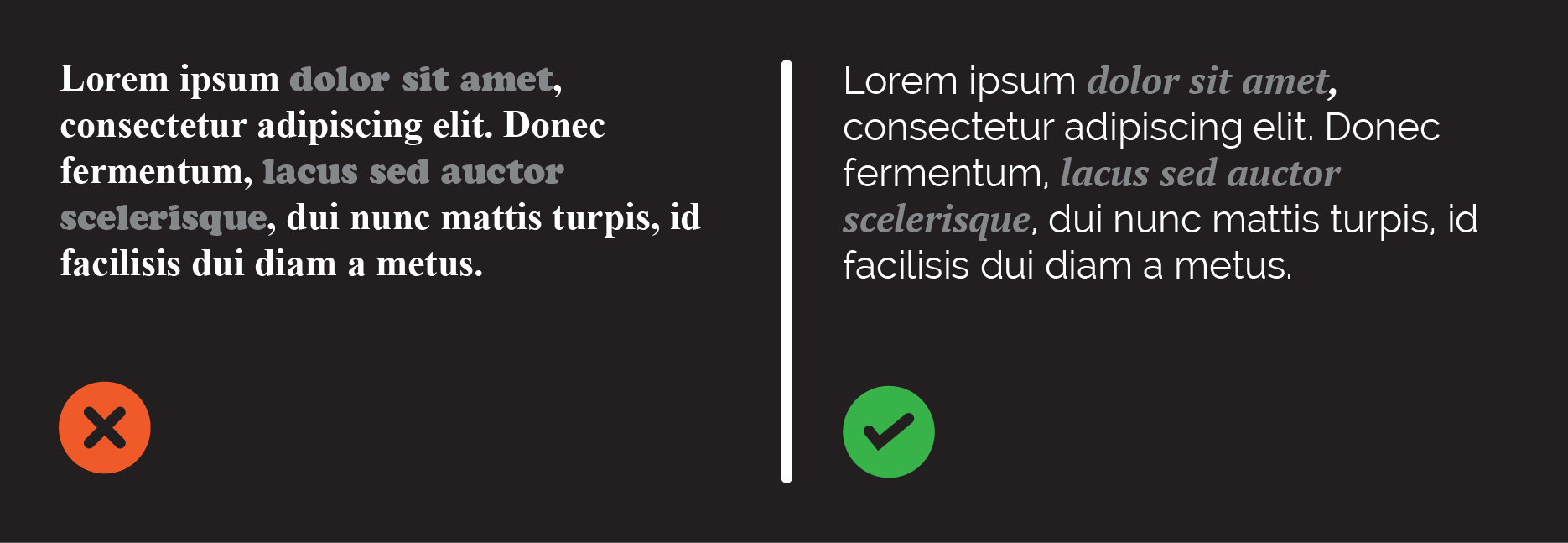
When picking your two fonts stay clear of conflict and aim for contrast. Choosing fonts for a design project is like choosing an outfit to wear. This means you shouldn’t pick typefaces that are too similar, as this causes trouble seeing what’s most important. Try fonts from the same family (light, bold, narrow, etc).
Get the mood right
Typefaces play a huge part in the feel of the design. Font for a serious presentation needs to be neutral, clean and conservative. For more fun things, like a comic book, fonts can have more personality and reflect the mood you want to present. Typeface can set a tone, so make sure your mood is right.
Keep it simple
That being said, fonts with more personality shouldn’t be used for big chunks of type. Relegate these to titles. Even then special effects and display fonts should be used with caution. They are very easy to get wrong. Use simple, clean fonts and you’ll be safe.
Don’t overemphasise
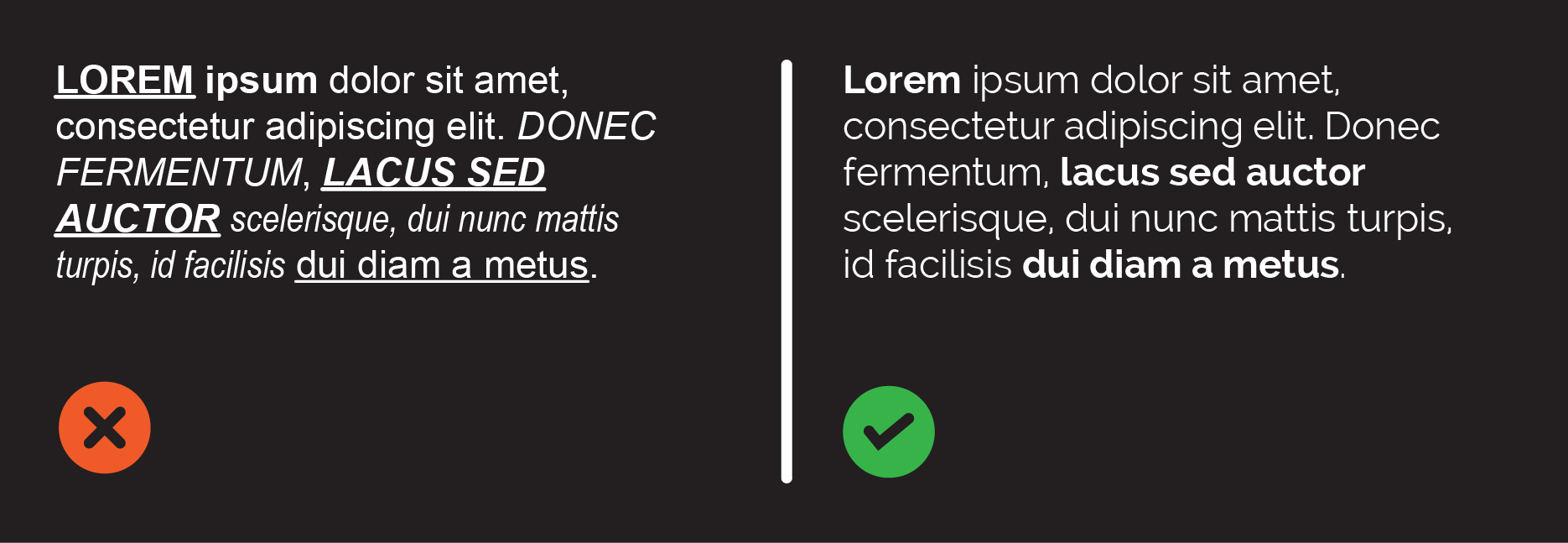
UNLESS YOU WANT THE READER TO FEEL LIKE SOMEONE IS SHOUTING AT THEM, DON’T USE ALL CAPS. Capital letters also take longer to read. If you want to use caps, do it sparingly for headlines. If you desperately want to emphasise something, there are loads of ways you can do this: bold, underline, italics, increasing the font size. Choose one way to avoid the messy look, but don’t choose the caps lock button.
Remember hierarchy
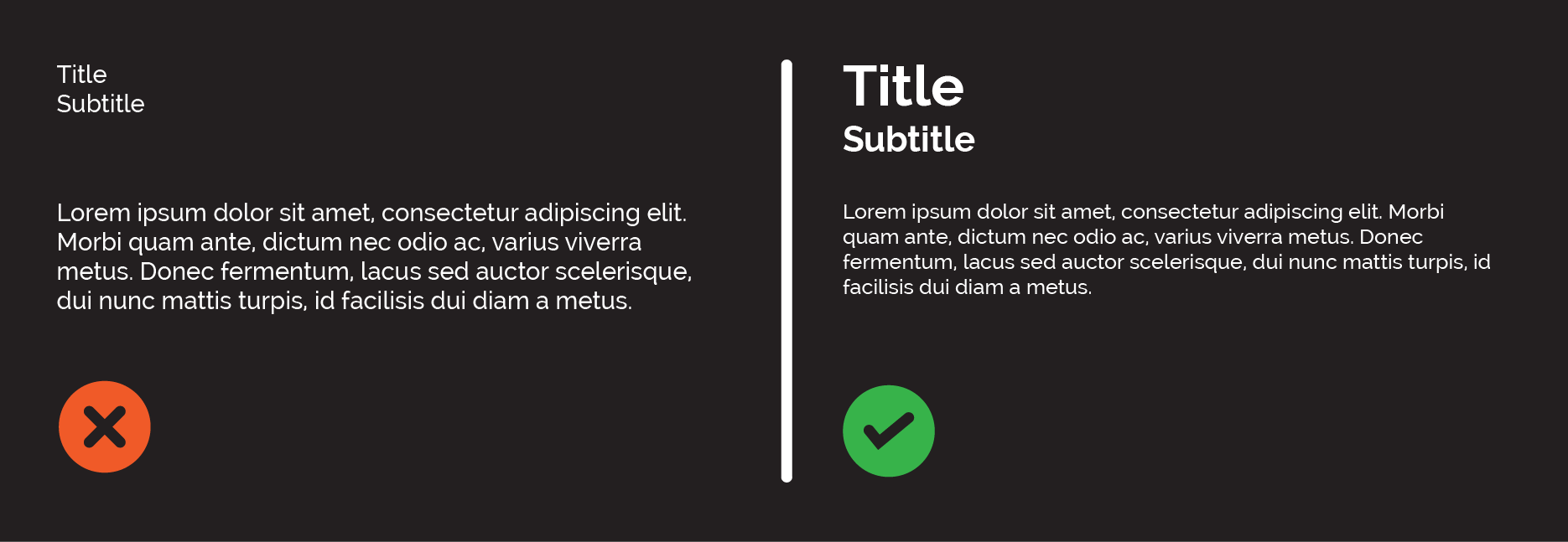
Visual hierarchy means making sure the reader knows which bits are most important or come first. Headlines come first, then sub-headings, then text. Make sure your layout and type reflects this.
Got anymore typography tips or questions? Then get typing & tweet us over at @infographicly_