The Psychology of Colour and How to Make It Work for Your Brand
We choose colours everyday without thinking. The colour of our nails, our cars, the mugs we drink tea out of -– we’ve chosen them for a reason, even if we don’t realise it.
Understanding the psychology of colour is therefore a key part of visual communication design: knowing more about the emotions colours evoke means we can use them to our advantage.
The impact of evolution and emotion on colour
 Why we like the colours we do is a bit of a mystery. There are many factors to consider: personal preference, culture and even the name of the colour (you’re more likely to pick “Flamingo’s Dream” colour over “Practical Beige” any day).
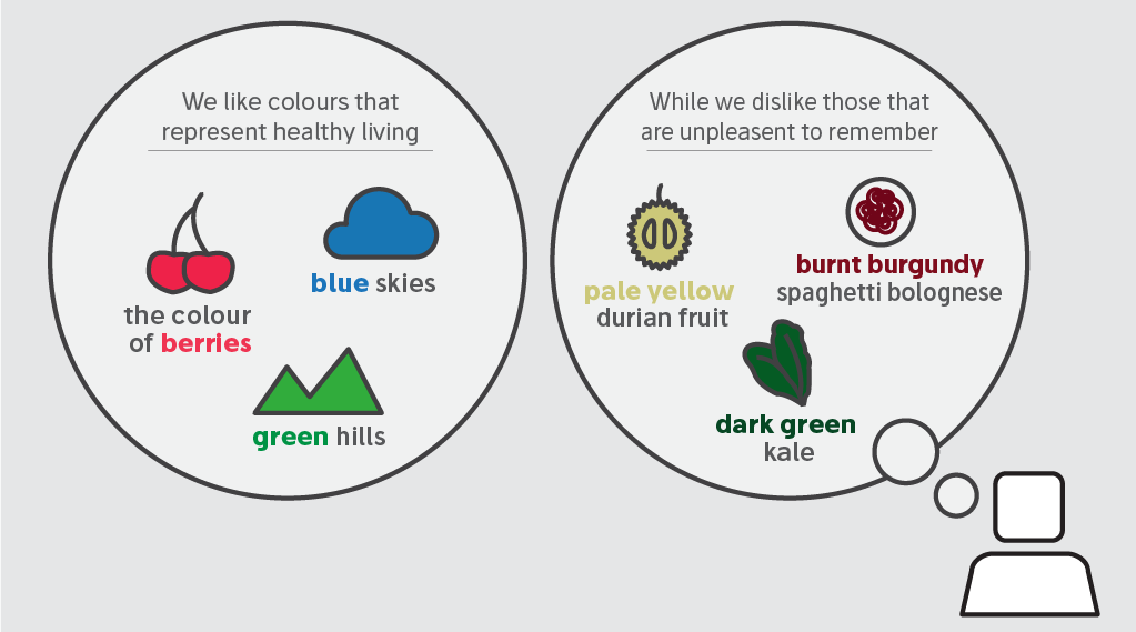
The general consensus is that it comes down to evolution and personal experience – a mix of our survival instincts and how we feel about the world around us. We like colours that represent healthy living – for example, the colour of berries, blue skies and green hills – while those that make us think of rotting food and vomit… not so much (sorry).
But we also know that people attach emotions and meanings to colours. Think about the worst thing you’ve ever tasted. Maybe it’s a pale yellow durian fruit, or dark green kale, or even your mum’s burnt burgundy spag bol. Either way, it’s probably the last colour you had in mind for your next sofa.
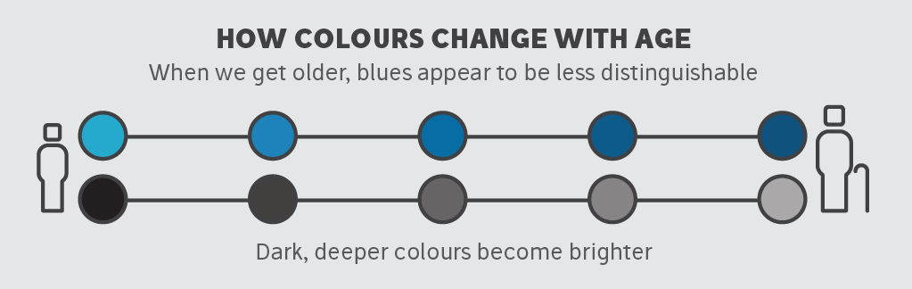 On top of this, how we see colours changes with age. It’s not until age 15 that teenagers can tell colours apart as accurately as adults. When we get older, blues appear to be less distinguishable from one another and dark, deeper colours become brighter.
So what colours should my brand be using?
From all of this it seems impossible to choose the right colours when designing for your business / project / report. But it’s not all a stab in the dark side of the colour wheel: there are some general rules that we can apply to predict what kind of responses colours will produce.
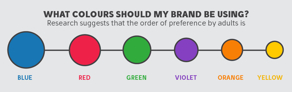 Research suggests that the order of preference by adults is blue, red, green, violet, orange and yellow, and this can be very useful in visual communication design. Of course favourite colours aren’t what it’s all about. After all who only has one favourite colour?
Colours are more about how they make us feel – and that can be very useful in business. Below we show how you can utilize the psychology of colour depending on what you want to get across.
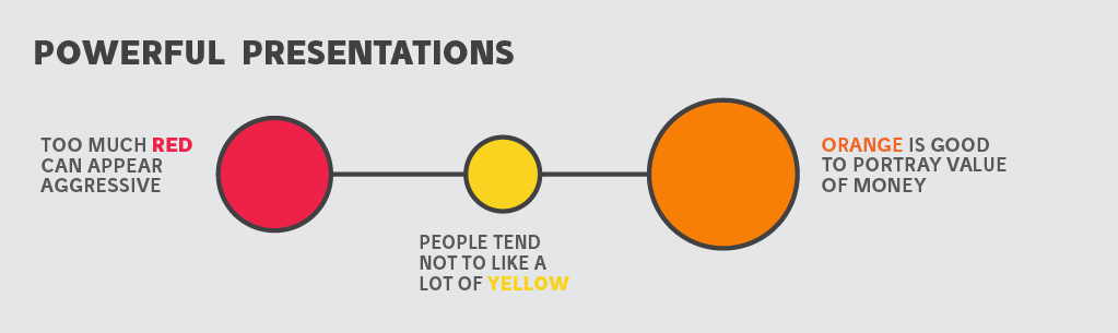 For a powerful presentation:
Use red, yellow and orange. These are the colours usually associated with stimulation, excitement and strength. Too much red can appear aggressive though, and people tend not to like a lot of yellow. Orange is a good colour if you want to portray good value for money.
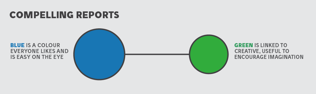 For a compelling report:
Use blue and green. Calm, peace, and stillness are associated with these colours. Blue is a colour everyone likes and is easy on the eye. Green on the other hand has been linked to more creative thought, which is useful if you want to encourage imagination.
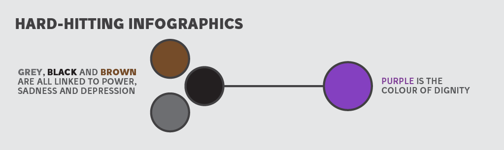 For a hard-hitting infographic:
Try using grey, black and brown and purple. Grey, black and brown are all linked to power, sadness and depression. So if you’re producing a compelling infographic on a serious topic these are the colours you need. Purple is the colour of dignity and again comes in useful for these types of projects.
To really make colours work for you, you need to think about your audience. How old are they, where are they from, what are they likely to respond to? Also think about what emotion you are trying to put across: you wouldn’t plaster the colour red all over a guide to meditation.
Above all though, trust your gut. We humans are built to see in colour and our instincts are powerful when choosing the right ones.
Got a question about colour? Tweet your question at the infographic.ly team @infograpicly_